A story about Australia’s corporate regulator titled, ASIC plans to rebrand itself as “strong, vigilant and fair”, was posted on the ABC’s website on Sunday evening. The story was taken down yesterday. Subsequent searches showed “Sorry, page not found”. A quick-witted contact of this website found a screenshot however. We reproduce the story here. The timing of the vanishing story is interesting as ASIC and Finance Minister Kelly O’Dwyer began a media blitz yesterday to sell their “tough new” enforcement plan to embed ASIC staff in banks.
ASIC plans to rebrand itself as “strong, vigilant and fair”
By Stephen Long
As rebrand plans go, it was more of a tweak than a full reno. But a proposed revamp of the “visual identity” of the corporate and financial services watchdog gives an insight into how the often-maligned regulator sees itself and wants to be seen. “We want the public to be confident,” the Australian Securities and Investments Commission told the creative agency Folk Pty Ltd.
“We need to be respected. Not loved. Strong. Accountable. Firm/fair. “Finger-on-the-pulse. Contemporary. Informed. Vigilant. Transparent. Responsive.” That’s the image ASIC wants to project, according to a document that’s fallen into the hands of the ABC.
“Dynamic, balanced and strong”
Folk was bidding for the business of sprucing up ASIC’s logo and the graphics on its publications. In language reminiscent of the refrain of the pigs in George Orwell’s Animal Farm, its pitch described the logo thus: “Symbol good. Type Bad.” The typeface was “meek”, apparently. “Quiet and a bit bookish.”
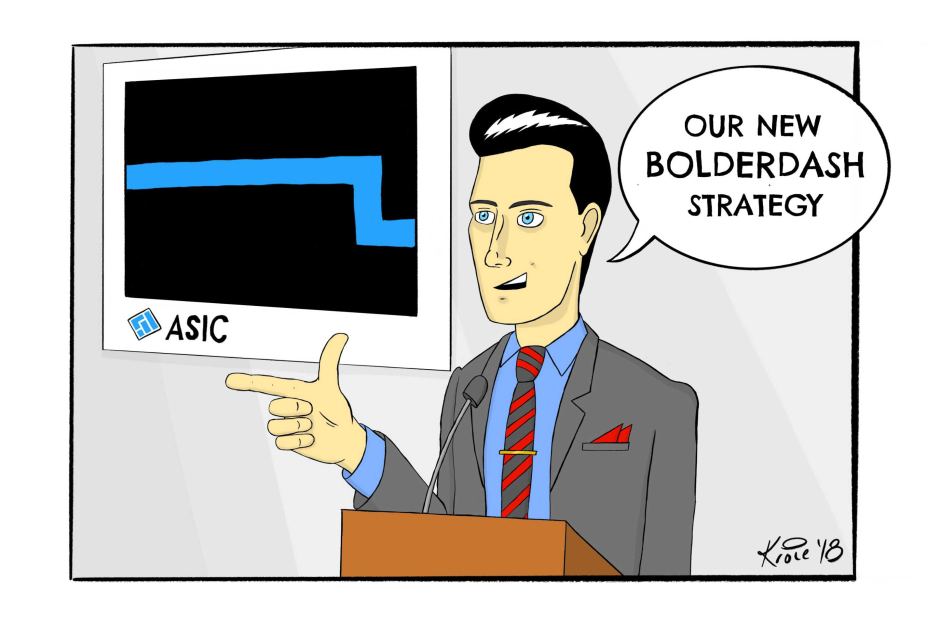
ASIC sought something that would show a “dynamic” regulator that was “balanced, unwavering, strong”. Bolder lettering was a no brainer, the creative agency suggested, but it didn’t stop there — much could be achieved with bolder borders around the corporate logo. And bold lines on letters and publications. A bold dash, here and there.
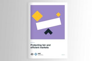
The creatives outlined a series of different symbols and styles for reports or presentations to present ASIC in different modes — “Watch and act”, “boundaries” (or laws and rules) and “activity”, with images that tread distantly on the far reaches of the trail blazed by Mondrian. Or maybe Mr Squiggle.
Whether the pitch was successful, and how much the entire endeavour cost, we do not know. All may be revealed at some stage by a corporate watchdog that wishes to be viewed as “transparent” and “accountable”.
How good was that!
We regard this as being reporter Stephen Long’s greatest work, certainly on par with our best story, the Qantas Rat’s Scandal, and express deep regret that the story disappeared from the website of the national broadcaster.
There is significant public interest in this story too. The systemic fraud by Australia’s largest financial institutions which has been chronicled at the Banking Royal Commission, right under ASIC’s nose, would surely never have occurred had the branding of the watchdog been bolder, more unwavering and strong.
We may find out today what happened to the original story. Perhaps somebody tapped the wrong key and accidentally deleted it. Perhaps the reporter was “Albericied”, a reference to the sudden disappearance of a tax story by ABC chief economics correspondent Emma Alberici, despite it being such an excellent, though of course unwitting follow-up of the multinational tax avoidance coverage right here at michaelwest.com.au.
Michael Broadhead, the managing director of design consultancy Folk, which is advising ASIC on its makeover and whose moniker is “Looking through a different lens”, has this on his LinkedIn profile:
I have global and regional experience with large multi-nationals and start-ups in Australia, United States, Singapore and China. I’ve also worked with a number of Australian, NSW and QLD Government agencies, including Department of the Prime Minister and Cabinet.
While we could not hope to match Michael’s chic, nouveau mondo design, we humbly suggest something conceptually different: a mascot, Snickers, to head up the campaign, “Come on, give us a tickle. We’ll lick you to death!”
Postscript
Some 12 hours after the Long story was taken down, it was put up again on ABC websites. Official line from management was that it was a “cock-up”, that the story was meant to run as a companion piece with another story. However, ABC insiders described it as self-censorship due to editorial management timidity.
Do you have a complaint to make about this story?
Lodge your complaint at [email protected] with Chief Executive Complaints, M West, after answering the following questions:
1. Do you work for the government?
2. Which one?
3. Is there anything wrong with the story or are you just being a whinger?
Public support is vital so this website can continue to fund investigations and publish stories which speak truth to power. Please subscribe for the free newsletter, share stories on social media and, if you can afford it, tip in $5 a month.
Michael West established Michael West Media in 2016 to focus on journalism of high public interest, particularly the rising power of corporations over democracy. West was formerly a journalist and editor with Fairfax newspapers, a columnist for News Corp and even, once, a stockbroker.


